Master Blocks
Feature Grid
Feature Grid block is a powerful and flexible tool for creating visually appealing grids of features on your WordPress website.
With its user-friendly interface and customization options, the Feature Grid block makes it easy to highlight multiple features in a clear and organized way. The block is fully responsive and can adapt to different screen sizes, providing a consistent user experience across devices.
Unlock a world of creative possibilities without spending a penny. Experience the future of content creation with Master Blocks for Gutenberg Editor plugin!
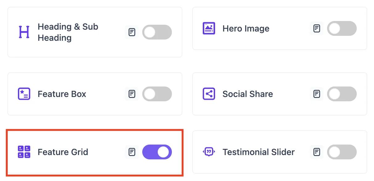
Activate the Feature Grid block
Before you can enable the Feature Grid block, it's essential to have the Master Blocks plugin installed and activated on your WordPress website. This plugin offers a convenient modular control panel that makes it easy to turn on or off any block as per your preference.
To activate the Feature Grid block, navigate to Master Blocks > Blocks. Then, toggle to enable the Feature Grid. After that, click on Save Settings.
Setting up
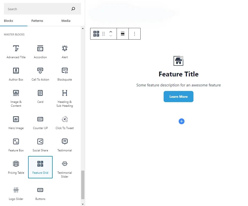
To add the Feature Grid block, navigate to the top toolbar click the "+" button, search for the Feature Grid, and select it. Alternatively, navigate to the content area, click the "+" button, type in "Feature Grid" and select it. The Feature Grid block will be instantly added to your content field.
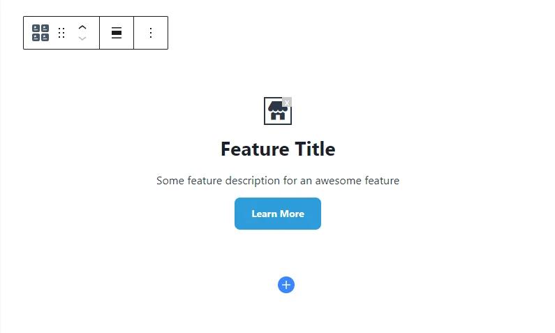
Now add the feature icon, type the title and description, and add button text and URL. To add a new feature box, click on the Add Feature Box. You can add as many feature boxes as you want.
The Feature Grid block offers great customization options. You can customize the Feature Grid block according to your requirements.
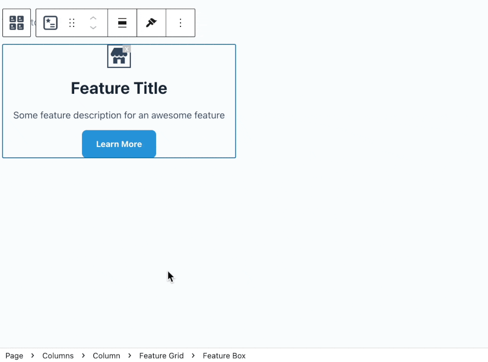
You can add new feature box, by just clicking on the + button of the feature grid block.
Primary
You can start customizing the Feature Grid block from the Primary tab.
From the Feature Grid section, you can change the number of columns. In addition, you can change the gap between the columns. Moreover, you can change the gap between the rows.

Style
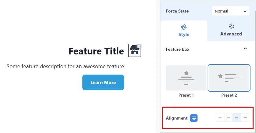
Change the feature box design from the Feature Box section. You can choose feature box designs from two preset designs. Moreover, you can change feature box content alignment from the Content Align option.
Change the feature box icon from the Icon section. In addition, you can change icon color, background color, icon size, icon padding, and icon radius. Also, you can change the gap between the icon and the feature title.
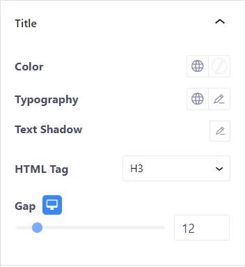
Change the feature title’s color, typography, text shadow, and HTML tag from the Title section. Also, you can change the gap between the feature title and the description.
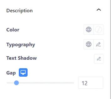
From the Description section, change the description’s color, typography, and text shadow. Also, you can change the gap between the description and the button using the Gap option.
Change the button’s typography and text shadow from the Button section. In addition, you can change the button and its hover color, background type, and background color. Moreover, you can change the border type, border color, border width, border radius, box shadow, and padding. Furthermore, you can change the button icon and the gap between the button text and the icon. Also, you can change the button’s margin top.

Advanced
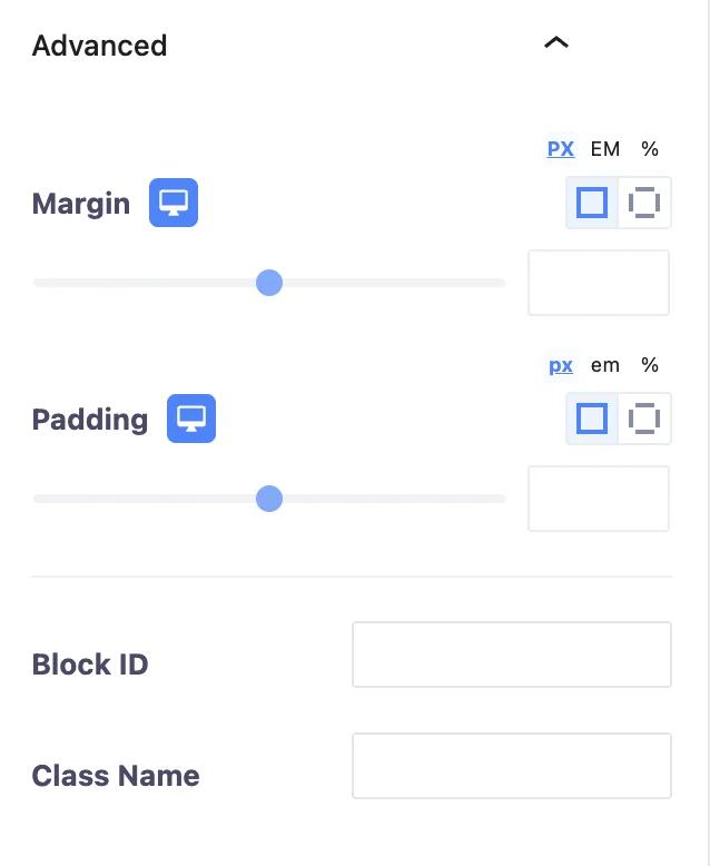
From the Advanced section you can change the Feature Grid block’s margin and padding. Also, you can add CSS class to the Feature Grid block.
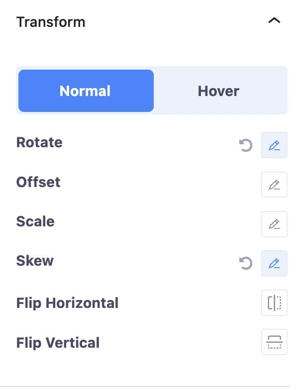
Change the Feature Grid block and its hover transformation from the Transform section. You can change the Feature Grid block and its hover rotation, offset, scale, and skew. Also, you can flip the Feature Grid block horizontally and vertically.
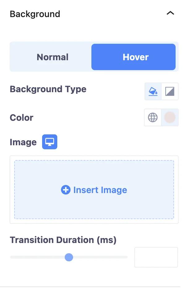
From the Background section, you can change the Feature Grid block and its hover background. You can change the background color and background type. Moreover, you can add an image to the background.
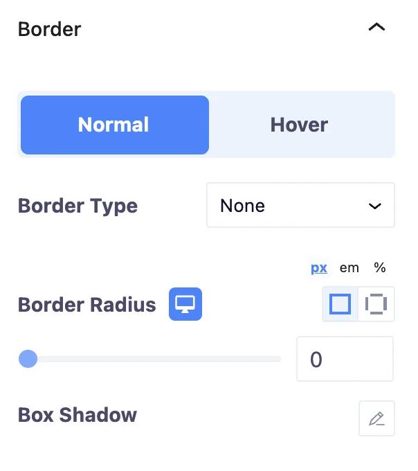
Add border to the Testimonial Slider block and its hover from the Border section. You can change the border type, border width, border color, border radius, and box shadow.
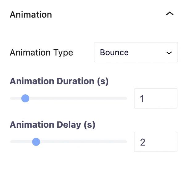
From the Animation section, you can add animaiton to the Testimonial Slider block. You can change the animation type. Moroever, you can change the animation duration and delay time.
Add mask to the Testimonial Slider from the Mask section. You can change mask shape, size, position, and repetation.

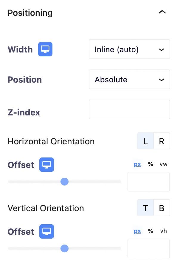
Change the Testimonial Slider block’s position from the Positioning section. You can change the Testimonial Slider block’s width and position.
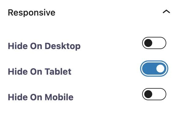
You can hide the Testimonial Slider block on the desktop, tablet, and mobile from the Responsive section.
Add additional CSS classes to the Feature Grid block from the Advanced section. That's all about this Feature Grid block.
Didn’t find what you were looking for? Get in touch!
Updated on June 17, 2023
Was this helpful to you?